SEBASTIAN.PINAUD.deZ.
From July 2017 to August 2019 I served as Urban Arts Partnership’s Creative Director. UAP is an art education non-profit whose mission is to close the achievement gap through providing arts-integrated curricula to NYC public schools.
As Creative Director I was involved in every single marketing and communications effort, from simple email campaigns to large scale fundraising events. As creative lead in a non-profit organization with no creative team but myself I was responsible for every single item of branding and design collateral. Through my time at UAP I collaborated with every single department within the organization in projects ranging from redesigning the org’s website to publishing Teaching Artist handbooks for our teachers to developing a comprehensive branding and style guide for the organization.
On this page is a sampling of some of my favorite work created during my time at Urban Arts Partnership.
My good friend Jared Schneider’s band The Exits is an old-school rock band following in the footsteps of bands like the Red Hot Chili Peppers and The Strokes.
As a huge fan of those two bands and a big believer that rock is gonna come back in a big way, I jumped at the chance of developing a visual identity for them.
Starting with their main logo (that we’ve cheekily never used in their single covers), I designed the artwork for their singles Please Don’t Tell, Gone, Stranded, and Wear Me Down.
I also directed the music videos for Please Don’t Tell and Stranded.
Merely the beginning of a beautiful artistic collab. This page will be constantly updated as we pump out more stuff.
I’ve known Native Sun frontman Danny Gomez since he was sixteen-years-old. Every time we met we’d compare lists of the top 5 albums we were listening to at the time. Being able to say his debut EP “Songs Born From Love and Hate” was on that list was unassailably cool. Being able to design the album cover was even more badass.
Danny and I had always wanted to collaborate on a project, and when Native Sun released its first single, “Sister,” that felt like the right time. In addition to single art, I also designed the band’s logo.
When it came time to release their first EP, I was once again called up to provide a sort of companion piece. While the art for “Sister” was meant to serve as a homage to The Boss, “Songs Born From Love and Hate” reached farther back in the pantheon of the Rock Gods and paid due tribute to Leonard Cohen; with an updated grid and palette to suit the band’s sound and diverse nature.
It’s been a pleasure working with you, brother.
(Photography by the inestimably cool Rachel Cabitt)
When designing for Modern Whale, I’ve always been encouraged by their frontman, Rob Guariglia, to follow the vibe I get from the tunes and experiment as much as I can. We usually land on a similar space and it’s really awesome to feel that kind of connection with someone your doing design work for. After all, despite design being an artform in and of itself, you’re still producing work whose main purpose is to represent somebody else’s craft (I won’t say the word “product”). In that sense, my collabs with Modern Whale have always been exciting, and I always look forward to the next one.
Included in this page is the single art that I made for Modern Whale’s “The Dirt” and “Dead Wrong” singles. Also, included, almost as a peak into my own design process and an example of how varied concepts can go, are variant designs for both singles (you can see, for example, how for “Dead Wrong” we decided to go with a more Stones vibe than Zeppelin).
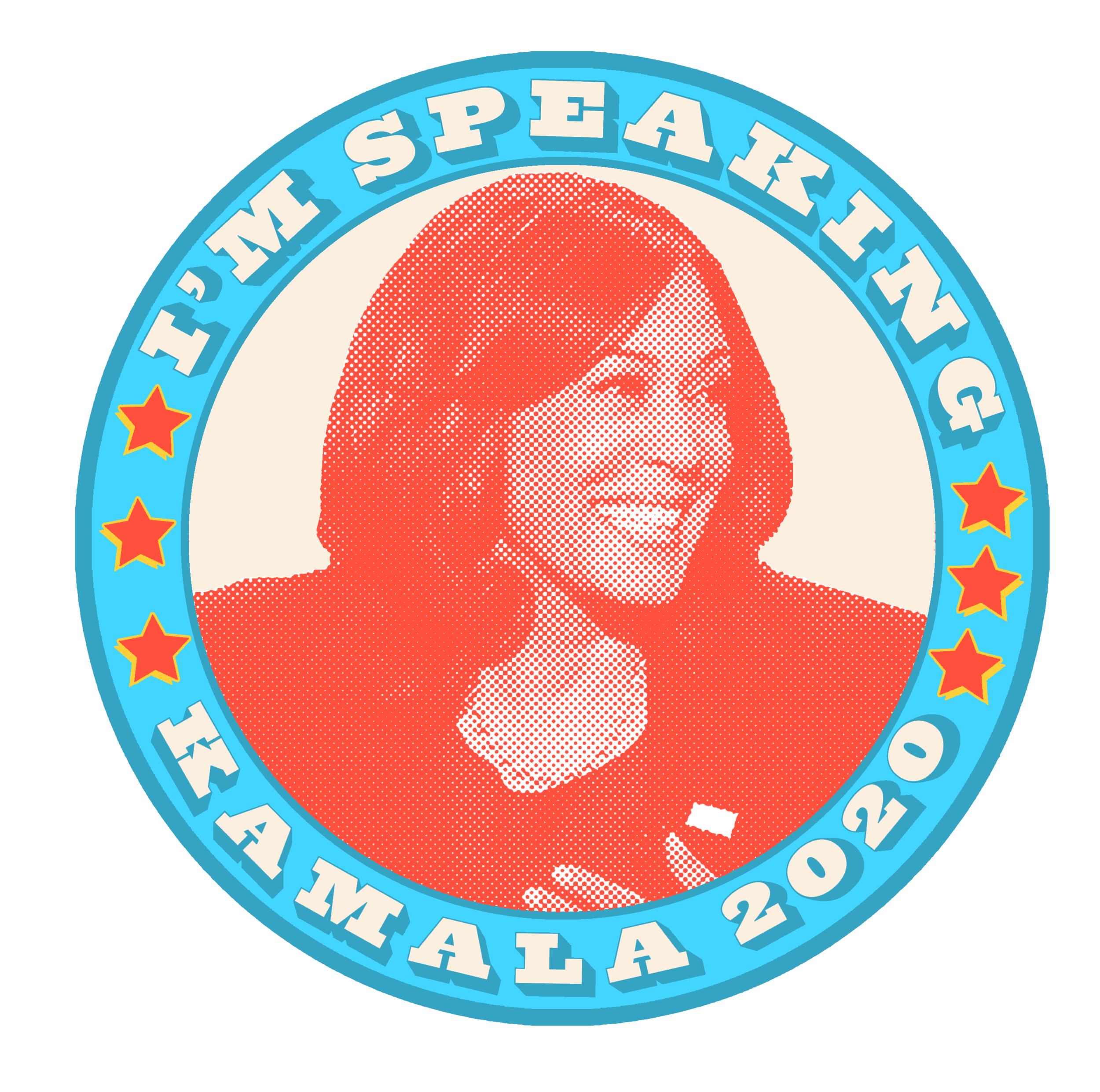
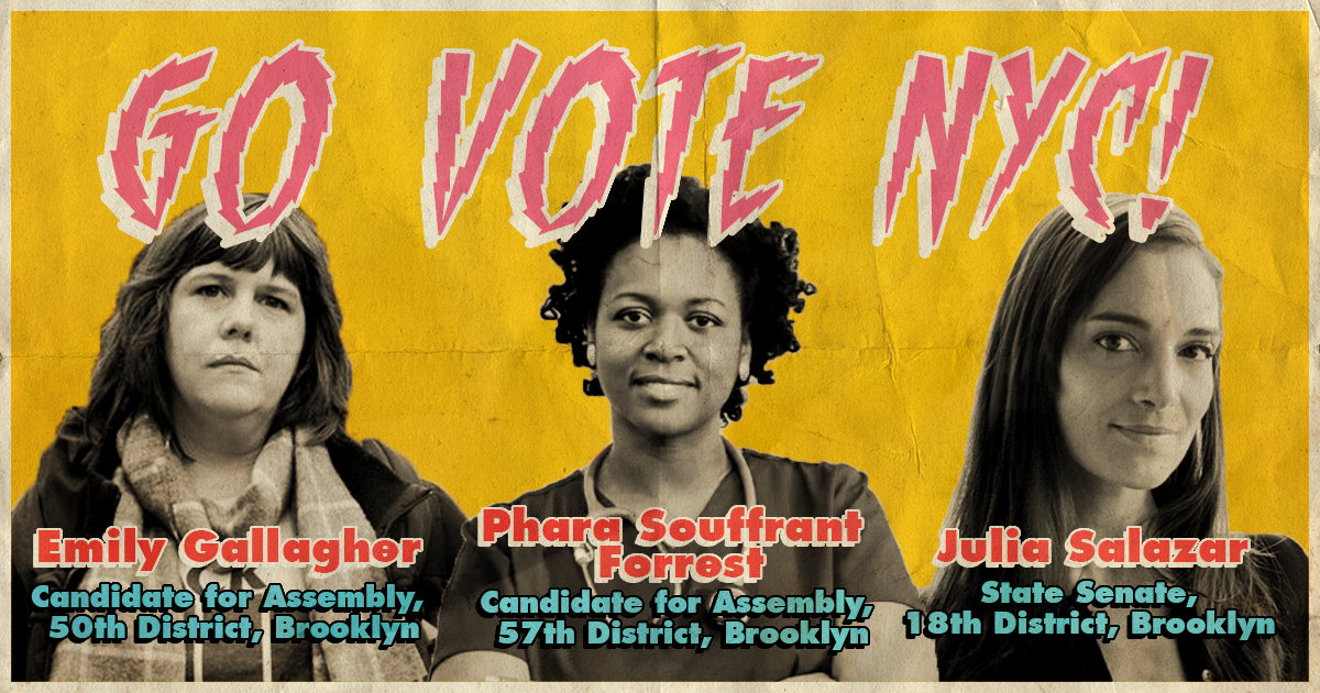
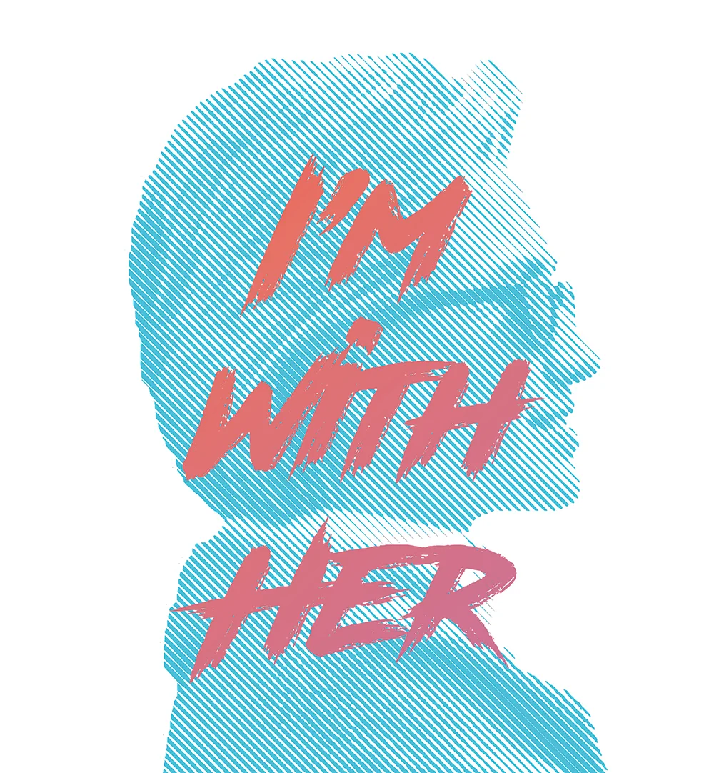
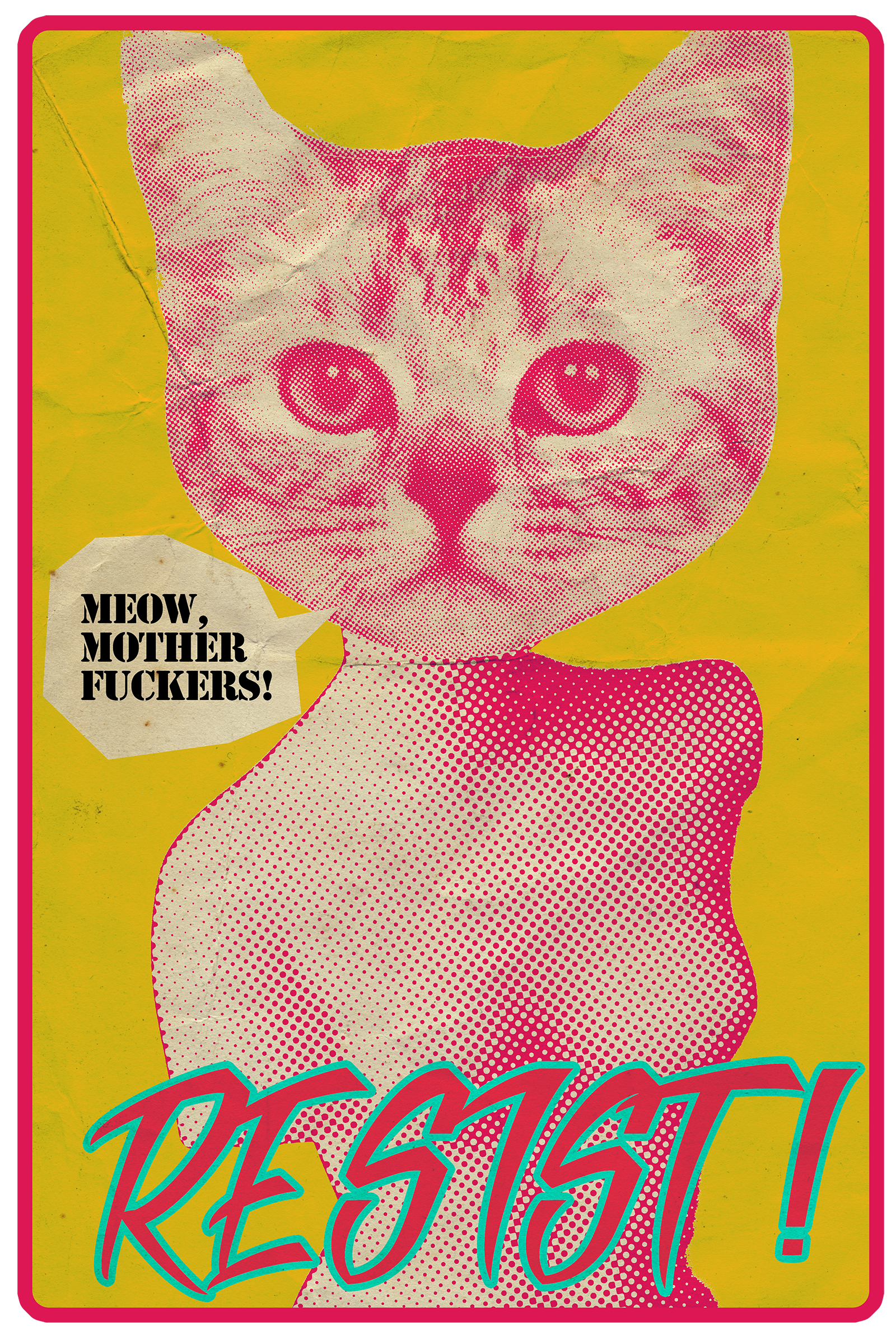
I’ve always been a firm believer that art, and most importantly graphic design, has a huge responsibility in calling out truth to power.
Growing up in Cartagena, Colombia, I was always inundated with images of ferociously designed political iconography, itself inspired by the amazing design work produced in Cuba during the revolution.
As such, I’ve always made it a habit to utilize my skills to help promote ideas or criticize oppression. As a public school graphic design teacher, I always encouraged my students to apply what we learn in class towards real social and systemic activism. Design as a revolutionary act for change is a tradition, harking back to Emory Douglas and the aforementioned Cuban artists, that I intend to always continue.
All the designs on this page are free to download and use in any activist endeavor. No permission or compensation necessary.
During my time getting an M.A. in Art Education at NYU, I was lucky enough to be selected to be part of a group that would be mentored in creating socially conscious art by the art activist group Gran Fury. The result of these sessions was the art collective The Oversight Committee.
The Oversight Committee was designed as a group of artists that would call attention to those in government abusing their power at the current time. I served as Lead Designer for all of our materials.
Our inaugural exhibit, Political Party, took place in May 2012 at the Manhattan LGBT Community Center. At the time the discourse amongst Republicans seemed to be purely centered around female reproductive rights (though to be honest, when is it not?); more specifically, Republicans’ belief that women needed to accept any consequences from assault and be limited and controlled in their decision making with regards to their pregnancies and reproductive rights.
For this show we decided to display these words at face value, with no caricature or satirical bent, so that the vapidity and misogyny at their hands would be on full display. A selection of the work produced for that show can be seen on this page.
I served as Design Director for VIDEOART.NET and it’s annual showcase, the Video Art and Experimental Film Festival, (VAEFF) from October 2012 through March 2013.
During my time at VIDEOART.NET I took it as my responsibility to update and rebrand both the website and the festival. I designed a new logo for the site (comparison to the very “Matrix green” early aughts logo can be seen on this page), as well as re-conceptualized the site’s user experience.
Additionally I branded the VAEFF to have a visual identity of its own that allowed the festival to stand on its own, while also retaining its relationship to VIDEOART.NET. The style guide and branding package I created for the VAEFF is still in use to this day. On this page is a sampling of inaugural design collateral for the VAEFF and the re-branded VIDEOART.NET.
From January 2010 to May 2011, I worked as a Gallery Assistant at NYU’s 80WSE galleries. One of my responsibilities was to serve as in-house graphic designer for the gallery’s weekly talks, screenings, and other events. I was tasked with designing flyers and promotional materials for events such as our Godard and Dziga Vertov Film Festival and the gallery’s retrospective of the artist Marlene MCCarty’s early work. I’ve saved my favorite pieces from those days and am happy to share them here.
I can’t help myself from designing. Whenever I’m bored, whenever I’m just chilling at home with my dog, Apollo, whenever I don’t have anything really “productive” to do, I’ll design posters, prints, stickers, whatever, for the most random stuff around. Whether I’m bingeing a Netflix docudrama (hello, Strang and Buting), or wondering what it’d be like for my buddy Jared and I to fight in a Lucha Libre match in Mexico City, or pondering the value of a vintage 70s paperback book about Apollo to leave for his petsitters when I’m out of town, I’m always designing.
Here’s where all those random stray thought design sketches live. Some of them make sense, some of them don’t, all of them are me.
Harambe Forever ✊🏽
Ad legend (and Don Draper inspiration) George Lois once said that “nowhere in the oeuvre of the world of graphic design, is everything I understand about the creative process more challenging than in the creation of a brand name in the form of a logo.” I concur.
Throughout my design career I’ve been extremely lucky in gaining the trust of both individuals and organizations to come up with a way of visually representing them. A logo should strive to brand its subject in a way that is both cohesively understandable, yet unequivocally unique in its intent to represent a specific identity. That is to say, I’ve always felt that a logo that adequately conveys the “feel” or vibe of its brand rather than what that brand “does” is infinitely more interesting.
That being said, Saul Bass I am not. But I’m trying. Here you can find logos I’ve designed and hold dear to my heart. They not only represent their respective brands, but who I am as well.